#javascript #html #css #reactjs #flexbox
Вопрос:
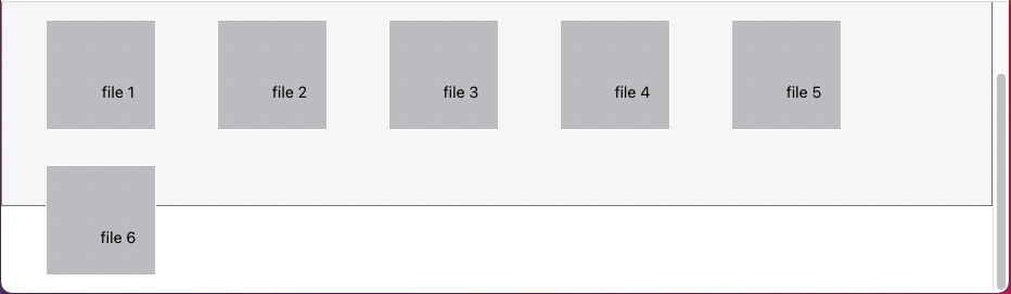
Когда я сжимаю страницу по вертикали, контейнер flex выходит за пределы flexbox.
Весь мой контент должен быть в серой зоне.
Я попытался изменить height свойство в классе css .App и .App__main , но это не работает.
App.js
 import "./styles.css";

import Content from "./Content";

export default function App() {
  return (
    <div className="App">
      <div className="App__main">
        <Content />
      </div>
    </div>
  );
}
Content.js
import React from "react";
import List from "./List";
import "./styles.css";
export default function Content() {
return (
<>
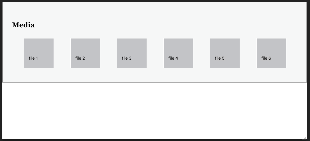
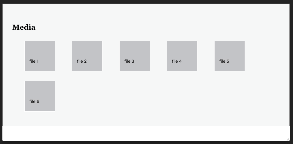
<div className="layout__container">
<h1 className="layout__container__title">Media</h1>
<List />
</div>
</>
);
}
List.js
 import "./styles.css";
import React, { useState } from "react";

export default function List() {
  const [list, setList] = useState([
    { id: 1, fileName: "file 1" },
    { id: 2, fileName: "file 2" },
    { id: 3, fileName: "file 3" },
    { id: 4, fileName: "file 4" },
    { id: 5, fileName: "file 5" },
    { id: 6, fileName: "file 6" }
  ]);
  return (
    <div className="list">
      {list.map((li) => {
        return (
          <figure title={li.fileName} key={li.id} className={"list__item"}>
            <div className="list__item__file">
              <div className="list__item__file__name">{li.fileName}</div>
            </div>
          </figure>
        );
      })}
    </div>
  );
}
styles.css
 body {
  margin: 0;
  height: 100%;
  font-family: -apple-system, BlinkMacSystemFont, "Segoe UI", "Roboto", "Oxygen",
    "Ubuntu", "Cantarell", "Fira Sans", "Droid Sans", "Helvetica Neue",
    sans-serif;
  -webkit-font-smoothing: antialiased;
  -moz-osx-font-smoothing: grayscale;
}

.App {
  text-align: center;
  background-color: #f6f7f7;
  border: 1px solid grey;
  height: 100vh;
}

.App__main {
  display: flex;
  height: 100%;
}

/* it's used to save some area for navigation bar */
.App__spacing {
  margin-top: 32px;
}

/* list */

.list {
  margin-top: 1rem;
  display: flex;
  flex-direction: row;
  justify-content: left;
  flex-wrap: wrap;
  flex-grow: 1;
}
.list .list__item {
  position: relative;
  width: 100px;
  height: 100px;
  margin-right: 1rem;
  margin-bottom: 1rem;
  background-color: white;
  border: 1px solid white;
  overflow: hidden;
  flex: 0 0 auto;
}
.list .list__item img {
  max-height: 100%;
  max-width: none;
  position: absolute;
  top: 50%;
  left: 50%;
  transform: translate(-50%, -50%);
}
.list .list__item .list__item__file {
  background-color: #c3c4c7;
  display: flex;
  flex-direction: column;
  justify-content: center;
  padding: 1rem;
  overflow: hidden;
  width: 100%;
  height: 100%;
}
.list .list__item .list__item__file .list__item__file__name {
  overflow: hidden;
  font-size: 0.9rem;
}
.list .list__item .ist__item__file .list__item__file__type {
  color: #8c8f94;
  font-size: 0.625rem;
  text-transform: uppercase;
  margin: 0 auto;
}
CodeSandbox:
https://codesandbox.io/s/agitated-dew-rlnw3?file=/src/App.js
Ответ №1:
App Контейнер с 100vh имеет статическую высоту и не увеличивается, чтобы соответствовать его содержимому.
 .App {
  text-align: center;
  background-color: #f6f7f7;
  border: 1px solid grey;
  height: 100vh;
}
Вместо этого используйте 100% родительский контейнер.
 .App {
  text-align: center;
  background-color: #f6f7f7;
  border: 1px solid grey;
  height: 100%;
}
Комментарии:
1. извините , я обнаружил, что пропустил урок
layout__container, я добавил его сейчас2. Кроме того, я не хочу скрывать гибкий элемент, я хочу, чтобы серая область регулировалась, если гибкий элемент переполняется
3. @CCCC О, я понимаю, наверное, я пошел не в том направлении. Пожалуйста, проверьте обновление.
4. @CCCC У тебя это когда-нибудь получалось?