#flutter #flutter-layout
#flutter #flutter-макет
Вопрос:
Возможно ли создать выделенную (прозрачную) кнопку с градиентной границей в flutter? Я пытался использовать LinearGradient в стиле BorderSide, но это запрещено.
Ответ №1:
Я потратил на это около двух часов 🙂
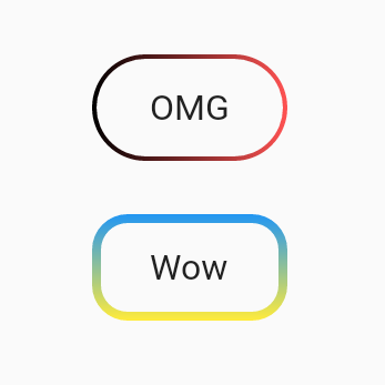
как использовать:
 import 'package:flutter/material.dart';

void main() => runApp(App());

class App extends StatelessWidget {
  @override
  Widget build(BuildContext context) {
    return MaterialApp(
      home: Scaffold(
        body: SafeArea(
          child: Center(
            child: Column(
              mainAxisSize: MainAxisSize.min,
              children: <Widget>[
                UnicornOutlineButton(
                  strokeWidth: 2,
                  radius: 24,
                  gradient: LinearGradient(colors: [Colors.black, Colors.redAccent]),
                  child: Text('OMG', style: TextStyle(fontSize: 16)),
                  onPressed: () {},
                ),
                SizedBox(width: 0, height: 24),
                UnicornOutlineButton(
                  strokeWidth: 4,
                  radius: 16,
                  gradient: LinearGradient(
                    colors: [Colors.blue, Colors.yellow],
                    begin: Alignment.topCenter,
                    end: Alignment.bottomCenter,
                  ),
                  child: Text('Wow', style: TextStyle(fontSize: 16)),
                  onPressed: () {},
                ),
              ],
            ),
          ),
        ),
      ),
    );
  }
}
и сам класс:
 class UnicornOutlineButton extends StatelessWidget {
  final _GradientPainter _painter;
  final Widget _child;
  final VoidCallback _callback;
  final double _radius;

  UnicornOutlineButton({
    @required double strokeWidth,
    @required double radius,
    @required Gradient gradient,
    @required Widget child,
    @required VoidCallback onPressed,
  })  : this._painter = _GradientPainter(strokeWidth: strokeWidth, radius: radius, gradient: gradient),
        this._child = child,
        this._callback = onPressed,
        this._radius = radius;

  @override
  Widget build(BuildContext context) {
    return CustomPaint(
      painter: _painter,
      child: GestureDetector(
        behavior: HitTestBehavior.translucent,
        onTap: _callback,
        child: InkWell(
          borderRadius: BorderRadius.circular(_radius),
          onTap: _callback,
          child: Container(
            constraints: BoxConstraints(minWidth: 88, minHeight: 48),
            child: Row(
              mainAxisSize: MainAxisSize.min,
              mainAxisAlignment: MainAxisAlignment.center,
              children: <Widget>[
                _child,
              ],
            ),
          ),
        ),
      ),
    );
  }
}

class _GradientPainter extends CustomPainter {
  final Paint _paint = Paint();
  final double radius;
  final double strokeWidth;
  final Gradient gradient;

  _GradientPainter({@required double strokeWidth, @required double radius, @required Gradient gradient})
      : this.strokeWidth = strokeWidth,
        this.radius = radius,
        this.gradient = gradient;

  @override
  void paint(Canvas canvas, Size size) {
    // create outer rectangle equals size
    Rect outerRect = Offset.zero amp; size;
    var outerRRect = RRect.fromRectAndRadius(outerRect, Radius.circular(radius));

    // create inner rectangle smaller by strokeWidth
    Rect innerRect = Rect.fromLTWH(strokeWidth, strokeWidth, size.width - strokeWidth * 2, size.height - strokeWidth * 2);
    var innerRRect = RRect.fromRectAndRadius(innerRect, Radius.circular(radius - strokeWidth));

    // apply gradient shader
    _paint.shader = gradient.createShader(outerRect);

    // create difference between outer and inner paths and draw it
    Path path1 = Path()..addRRect(outerRRect);
    Path path2 = Path()..addRRect(innerRRect);
    var path = Path.combine(PathOperation.difference, path1, path2);
    canvas.drawPath(path, _paint);
  }

  @override
  bool shouldRepaint(CustomPainter oldDelegate) => oldDelegate != this;
}
Комментарии:
1. выдает некоторую нереализованную ошибку. Я был в flutter web.
2. Это должно быть в библиотеке dart! Кстати, как мы устанавливаем размер кнопки?
3. Я опубликовал пакет pub.dev/packages/outline_gradient_button он по-прежнему не работает в Интернете, потому что операции создания шейдеров и пути пока не поддерживаются, подождет, может быть, что-то изменилось
Ответ №2:
Вы можете добиться этого, выполнив простой трюк
Вы должны определить два контейнера. Первый внешний контейнер с градиентным фоном и второй внутренний контейнер с белым фоном. и в качестве дочернего элемента внутреннего контейнера вы можете разместить что угодно, например, TextField , Text другую кнопку и т.д.
 final kInnerDecoration = BoxDecoration(
  color: Colors.white,
  border: Border.all(color: Colors.white),
  borderRadius: BorderRadius.circular(32),
);

final kGradientBoxDecoration = BoxDecoration(
  gradient: LinearGradient(colors: [Colors.black, Colors.redAccent]),
  border: Border.all(
    color: kHintColor,
  ),
  borderRadius: BorderRadius.circular(32),
);
Теперь это ваш вид
   Container(
    child: Padding(
             padding: const EdgeInsets.all(2.0),
             child: Container(
                      child:Text("Button Title with your style"),
                      decoration: kInnerDecoration,
                    ),
           ),
    height: 66.0,
    decoration: kGradientBoxDecoration,
  ),
Выполнено

Комментарии:
1. Это не просто прозрачная кнопка, в дочернем вы можете использовать любой другой виджет
2. О, теперь я понял вашу точку зрения. Да, она не будет работать как прозрачная кнопка. Однако я буду рекомендовать это. Потому что вместо белого, если вы установите цвет вашего экрана в качестве цвета внутреннего контейнера, это будет казаться прозрачной кнопкой. например, если цвет фона экрана синий, задайте цвет внутреннего контейнера как синий. Спасибо.
3. А что, если под кнопкой есть изображение? Ваш ответ неверен, потому что ваша кнопка непрозрачна, вы просто подбираете цвета.
4. @Oleksandr Будет странно, если внутри кнопки появится какое-либо изображение. Конечно, все хотят видеть только текст кнопки, а не содержимое экрана внутри кнопки. И вы, возможно, правы. возможно, этот ответ не соответствовал вашему требованию. Я только что поделился своим кодом, за который боролся. Использовать этот код или нет — решать исключительно вам. Спасибо, что поделились своими мыслями.
5. Спасибо @valeriana, также я действительно не помню, какого цвета она была. Вы можете выбрать любой цвет в соответствии с вашими потребностями.
Ответ №3:
Используйте OutlinedButton (рекомендуется)

Создайте этот класс (код, защищенный от нуля)
 class MyOutlinedButton extends StatelessWidget {
  final VoidCallback onPressed;
  final Widget child;
  final ButtonStyle? style;
  final Gradient? gradient;
  final double thickness;

  const MyOutlinedButton({
    Key? key,
    required this.onPressed,
    required this.child,
    this.style,
    this.gradient,
    this.thickness = 2,
  }) : super(key: key);

  @override
  Widget build(BuildContext context) {
    return DecoratedBox(
      decoration: BoxDecoration(gradient: gradient),
      child: Container(
        color: Colors.white,
        margin: EdgeInsets.all(thickness),
        child: OutlinedButton(
          onPressed: onPressed,
          style: style,
          child: child,
        ),
      ),
    );
  }
}
Использование:
 MyOutlinedButton(
  onPressed: () {},
  gradient: LinearGradient(colors: [Colors.indigo, Colors.pink]),
  child: Text('OutlinedButton'),
)
Комментарии:
1. Если присмотреться, у нее другой радиус границы
Ответ №4:
Чтобы изменить размер, вы можете вставить контейнер:
 OutlineGradientButton(
  child: Container(
    constraints: BoxConstraints(maxWidth: 300, maxHeight: 50),
    height: 50,
    alignment: Alignment.center,
    child: Text(
      'Text',
      textAlign: TextAlign.center,
      style: TextStyle(
          color: Colors.white, fontSize: 20, fontWeight: FontWeight.w500),
    ),
  ),
  gradient: LinearGradient(
    colors: [Color(0xfff3628b), Color(0xffec3470)],
    begin: Alignment.topCenter,
    end: Alignment.bottomCenter,
  ),
  strokeWidth: 3,
  radius: Radius.circular(25),
),
Ответ №5:
Теперь предусмотрен более простой способ. У Flutter теперь есть пакет, который отлично справляется с этой задачей. Я оставляю ссылку на документацию для дальнейшего использованияhttps://pub.dev/packages/gradient_borders .
Ответ №6:
Вы можете использовать структуру, подобную приведенной ниже. Вы также можете использовать ее как плоскую кнопку, удалив borderRadius.

 InkWell(
      onTap: () {
        print("TAP");
      },
      child: Container(
        height: 85,
        width: 85,
        padding: EdgeInsets.all(6),
        decoration: BoxDecoration(
          borderRadius: BorderRadius.circular(100),
          gradient: LinearGradient(
            colors: [Colors.blue, Colors.black],
            begin: Alignment(-1, -1),
            end: Alignment(2, 2),
          ),
        ),
        child: Center(
          child: ClipRRect(
            borderRadius: BorderRadius.circular(100),
            child: Container(
              decoration: BoxDecoration(
                borderRadius: BorderRadius.circular(100),
                image: DecorationImage(
                  image: Image.network("https://images.unsplash.com/photo-1612151855475-877969f4a6cc?ixlib=rb-1.2.1amp;ixid=MnwxMjA3fDB8MHxzZWFyY2h8MXx8aGQlMjBpbWFnZXxlbnwwfHwwfHw=amp;w=400amp;q=80").image,
                  fit: BoxFit.fitHeight,
                ), //By deleting the image here, you can only use it text.
                color: Colors.white,
                border: Border.all(
                  color: Colors.white,
                  width: 4,
                ),
              ),
              child: Center(child: Text("sssss")), //By deleting the text here, you can only use it visually.
              width: 75,
              height: 75,
            ),
          ),
        ),
      ),
    )
Ответ №7:
Оберните виджет CustomPaint шириной вашего виджета и используйте этот _CustomGradientBorder, который расширяет CustomPainter.
 CustomPaint(painter: const _CustomGradientBorder(thickness: 1,
      colors: [Colors.red, Colors.green, Colors.blue, Colors.tealAccent],
      radius: 8), child: //widget here)

class _CustomGradientBorder extends CustomPainter{
final double thickness;
final List<Color> colors;
final double radius;
const _CustomGradientBorder({required this.thickness, required this.colors, required this.radius});

@override
void paint(Canvas canvas, Size size) {
final Path path = Path();
path.moveTo(0, size.height/2);
path.lineTo(0, radius);
path.quadraticBezierTo(0, 0, radius, 0);
path.lineTo(size.width-radius, 0);
path.quadraticBezierTo(size.width, 0, size.width, radius);
path.lineTo(size.width, size.height-radius);
path.quadraticBezierTo(size.width, size.height, size.width-radius, size.height);
path.lineTo(radius, size.height);
path.quadraticBezierTo(0, size.height, 0, size.height-radius);
path.close();
final Paint paint = Paint()
..style = PaintingStyle.stroke
..shader = LinearGradient(colors: colors).createShader(Rect.fromCenter(center: Offset(size.width/2, size.height/2), width: size.width, height: size.height))
..strokeWidth = thickness;
canvas.drawPath(path, paint);
}

@override
bool shouldRepaint(covariant CustomPainter oldDelegate) {
  return true;
}
}
Ответ №8:
 class GradientBorderWidget extends StatelessWidget {
  final Widget child;
  const GradientBorderWidget({super.key, required this.child});
  @override
  Widget build(BuildContext context) {
  return Container(
  padding: const EdgeInsets.symmetric(horizontal: 1.5, vertical: 1.5),
  width: double.infinity,
  decoration: BoxDecoration(
      borderRadius: BorderRadius.circular(15),
      gradient: const LinearGradient(
          colors: [color1, color2, color3],
          begin: Alignment.centerLeft,
          end: Alignment.centerRight)),
    alignment: Alignment.center,
    child: ClipRRect(borderRadius: BorderRadius.circular(15), child:
    child),
    );
    }
    }
Ответ №9:
Я перепробовал много способов сделать это, но все они имели свои ограничения, затем я нашел пакет, который работал так, как я ожидал: https://pub.dev/packages/outline_gradient_button
Комментарии:
1. Это пакет от пользователя из принятого ответа. Он связал ее в комментарии.